Best Font Sizes for a Professional Resume
At Everyday Next, we know that nailing the perfect resume—it’s about more than just the words on the page. Seriously, the font size can tip the scales between you and that dream job.
Font size on a resume—it’s a big deal. We’re talking readability, professionalism, the whole package. In this post, we’re gonna walk you through the best font sizes for different resume elements, so your application pops for all the right reasons.
What Font Sizes Work Best for Resume Headers?
Your resume’s headers are the GPS for recruiters navigating your professional journey. At Everyday Next, after dissecting endless resumes, we’ve figured out that the right header sizes? They can really zap your application into another dimension of success.
Make Your Name Stand Out
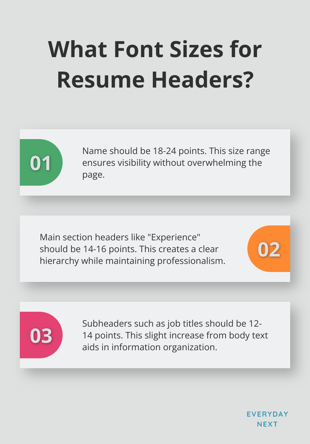
Your name-it’s gotta be the star of the show. Crank up that font size to somewhere between 18 and 24 points to give it the spotlight it deserves. This sweet spot ensures your name is loud but not shouting off the page. (If your name’s on the longer side-scale it down just a notch to keep it looking snazzy.)
Section Headers That Guide the Eye
Main section headers-think “Experience” or “Education”-should be rocking a font size between 14 and 16 points. Why? It carves out a nice hierarchy without bumping elbows with your name. It’s big enough to be noticed but polite enough to keep it all professional.
Subheaders for Clarity
Subheaders, like job titles or degree names, should tiptoe slightly ahead of your body text in size. Aim for 12 to 14 points here. This gentle nudge in size helps sift through your info without turning it into a jumbled mess.
Consistency is Key
Once you’ve locked in those sizes, stick with them like glue throughout your resume. The result? A polished, professional look that’s a visual treat. (Keeping font sizes steady can massively boost readability and leave a lasting impression.)
The Impact of Well-Sized Headers
A study showed that employers typically spend just six to seven seconds scanning resumes. Clear, well-sized headers can really spotlight your crucial info in that blink-of-an-eye window.
Now that we’ve dissected the ideal font sizes for your resume headers, let’s tackle the body text. Nailing the right balance between header and body text sizes can make your resume not just a visual feast but also a breeze to skim through.
What Font Size Works Best for Resume Body Text?
Alright, let’s dive into the black-and-white world of resume aesthetics-where font size can be the unsung hero of your job hunt. The body text of your resume isn’t just letters on a page; it’s your professional superhero cape-delivering your career saga.
The Ideal Range for Body Text
Finding that perfect Goldilocks zone for font size-between 10 to 12 points-is all about the sweet spot between visibility and real estate. Start at 11 points, why not? Tweak from there, depending on your epic tale’s length and the limits of a single sheet of paper. It’s bold enough to be seen, yet sleek enough to keep all your greatness on one page.
Customizing Font Size for Different Sections
This isn’t a one-size-fits-all gig-tune the font for different resume realms:
- Work Experience and Education: Stick to the 10-12 point alley for these headliners.
- Skills or Summary: Think about going a smidge smaller (9-10 points). More info, less clutter-boom.
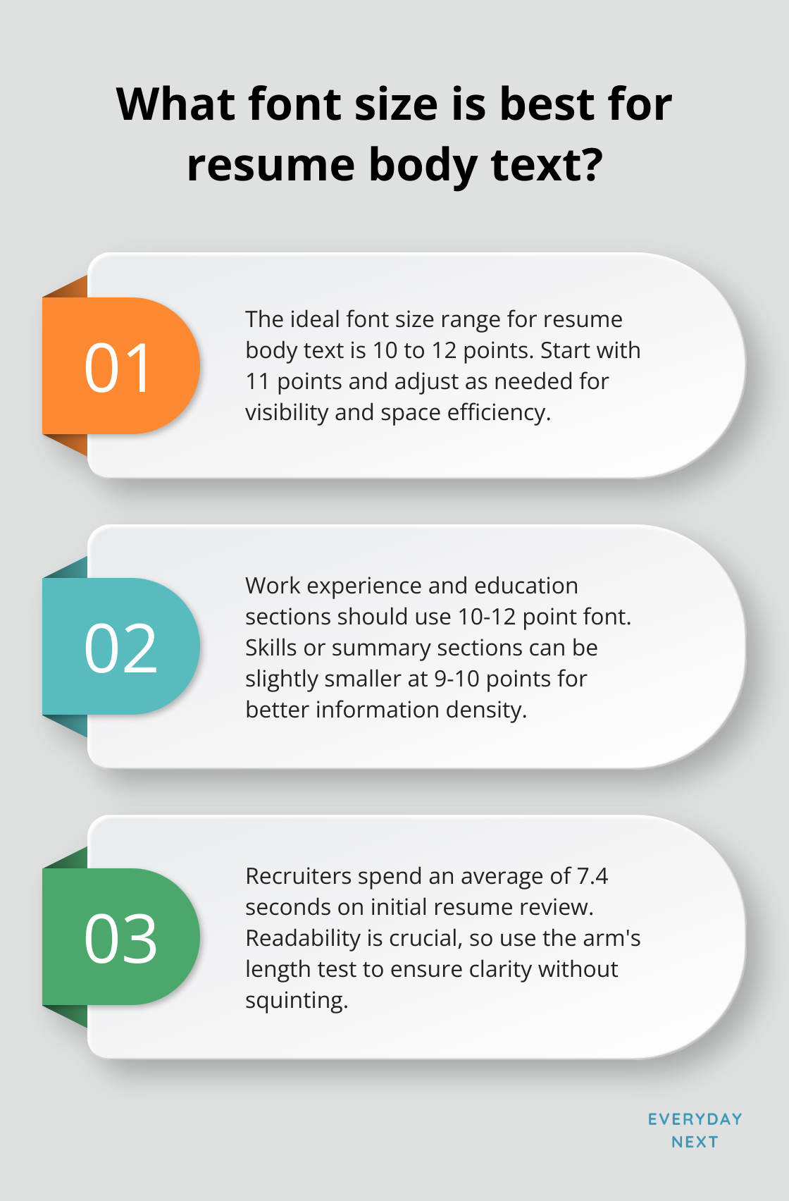
Remember that study? The one by TheLadders? Recruiters are blink-and-you-miss-it, spending like 7.4 seconds on that first resume impression. So, clarity isn’t just nice-it’s essential.
Balancing Readability and Information Density
Let’s get pragmatic: Your resume should be the smoothest read this side of a novel. Here’s a pro-tip: give it the ol’ arm’s length test. If it’s readable without squinting-congrats, you’re golden. If your eyes start to cross, well, time to up the font a tick.
Don’t forget the power of white space-your resume’s breathing room. Cramming content by shrinking your font? Rookie move. As per our pals at NACE, employers have a thing for resumes that balance substance with style-meaning, give those sections and bullet points some room to breathe.
ATS Compatibility
Before your masterpiece even meets a recruiter, it’s got to tango with the ever-mysterious ATS. These systems? They prefer the Goldilocks font range-neither too tiny to read nor too glaringly large. Stick with 10-12 points to keep things ATS-friendly and human-easy.
Nailing that font size on your resume is like stealthily sneaking into the interview room before you even get the call. It’s a seemingly small tweak that can blow your job prospects wide open. Next up: how to tailor font sizes to distinct resume styles, giving your application an extra boost in the competitive job jungle.
How Font Sizes Vary Across Resume Formats
Let’s talk fonts. Different resume formats? They demand a unique game plan when it comes to font sizing. Imagine your resume as a billboard-you want it big and bold, but also not too IN-YOUR-FACE. The right font size can be the golden ticket to capturing that hiring manager’s attention.
Traditional Resume Font Sizes
Old school, baby. Classic paper resumes have a font size pecking order. Your name? The star of the show-18-24 points. Section headers? Give ’em 14-16 points to shine. And the body text? 10-12 points, like a smooth jazz melody-easy on the eyes. It’s all about making sure those managers with a love for paper can actually read your stuff without squinting.
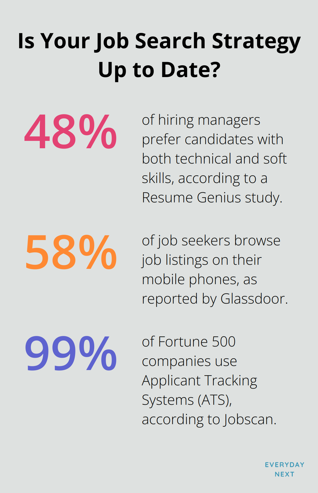
A Resume Genius study tells us that 48% of hiring honchos are all about candidates who tango with both technical and soft skills. It’s a reminder, folks-your resume’s gotta strut its stuff right, especially on paper.
Digital Resume Font Considerations
Ah, the pixelated landscape of digital. Screen resolution is your frenemy here. Pump up that body text to 11-12 points to dodge the pixelation monster on all those devices lurking out there. Section headers can strut at 16-18 points for max scannability.
Think mobile-first-because Glassdoor says 58% of job seekers are scrolling through job listings on their phones. (You want your resume to stand tall on those tiny screens, right?)
ATS-Friendly Font Sizing
The robots are watching. Applicant Tracking Systems (ATS) are like the bouncers at the digital resume club. They favor a steady diet of 10-12 point body text. (No wild rides on the font size roller coaster-confuse ’em and your resume’s getting bounced.)
Jobscan says 99% of the Fortune 500 are in cahoots with ATS. Going ATS-friendly isn’t a choice-it’s your way past the velvet rope to human eyes.
Font Size Adjustments for Creative Fields
Get your creative juices flowing. Creative industries? They’re the Wild West of resume land. You can dance with slightly larger font sizes-12-14 points for text and up to 20 points for headers. (Show off your design flair while keeping it class-act professional.)
Balancing Font Sizes with Resume Length
Size matters. If you’re working with a single page, maybe keep it cozy-10-11 points to fit in more. Got a two-pager? Relax those fonts to 11-12 points for a comfy read without chopping your story short.
Final Thoughts
Picking the right font size for your resume-it’s not rocket science, but it can tank your job application if you get it wrong. You’ve got to make your name the rockstar here, so give it a solid 18-24 points. Your section headers? Aim for a good 14-16 points. The body text? That’s your workhorse-keep it tidy at 10-12 points. This hierarchy? It’s not just for looks. It’s your lifeline to grabbing the recruiter’s attention in mere seconds. Consistency is your new BFF-show ’em you mean business across the whole document.
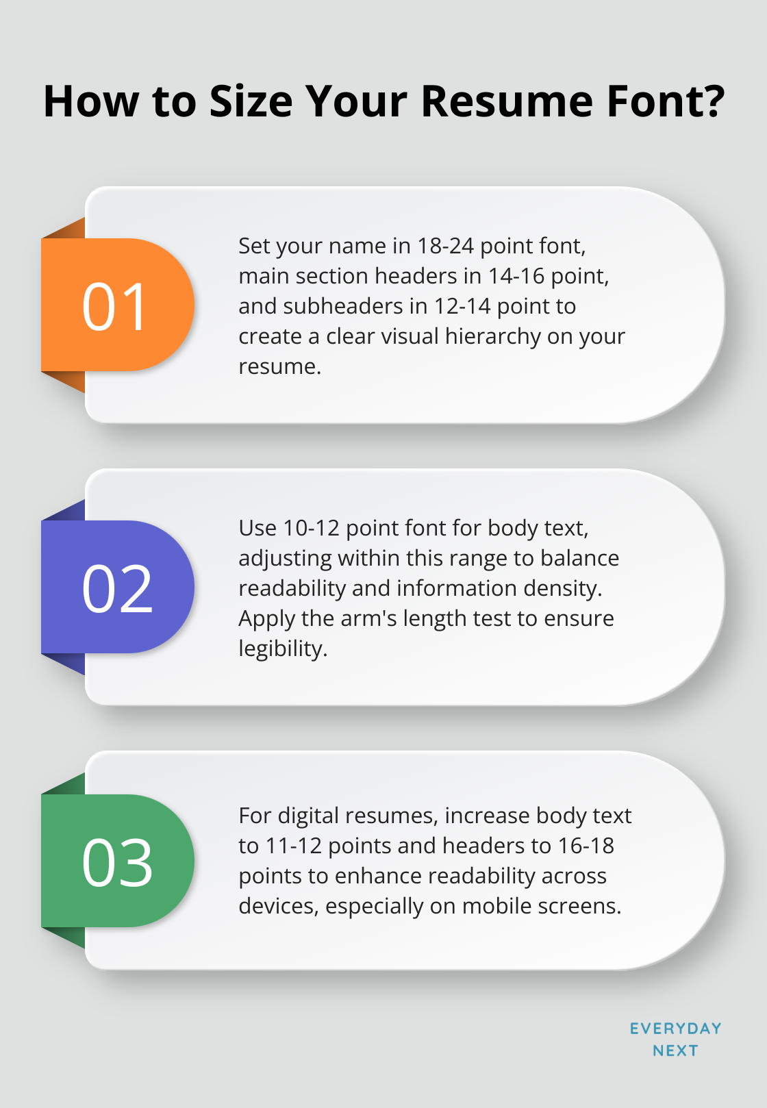
Okay, so let’s talk resume formats. You think it’s one-size-fits-all? Nope. Digital versions might want a little more oomph with larger fonts, while old-school paper resumes are cool with the standard sizes. And remember-it’s 2025, folks!-ATS systems are watching, so that 10-12 point body text is your best bet. (And yes, a clean font, generous margins, and some decent spacing can really make your resume pop.)
Nailing those font sizes? It’s just one piece of the puzzle to constructing a killer application. For more wisdom on career kung fu and personal growth magic, check out our vault of knowledge at Everyday Next. We’re all about steering you through every twist and turn of your career journey.
