How to Create a Professional Resume in Google Docs
Table of Contents
It’s a fact that Hiring managers spend an average of 6 seconds scanning your resume before deciding if you make the cut. Six Seconds.
That means your resume needs to be sharp, professional, and stand out instantly—but let’s be honest, no one wants to waste hours wrestling with formatting or spend money on expensive design tools.
Good news? Google Docs has your back.
At Everyday Next, we’ve already covered how to craft a winning resume and the Harvard resume format—but today, we’re keeping it simple: how to create a sleek, professional resume in Google Docs with zero frustration.
If you’re ready to make recruiters stop and actually read your resume (instead of tossing it in the reject pile), let’s dive in.
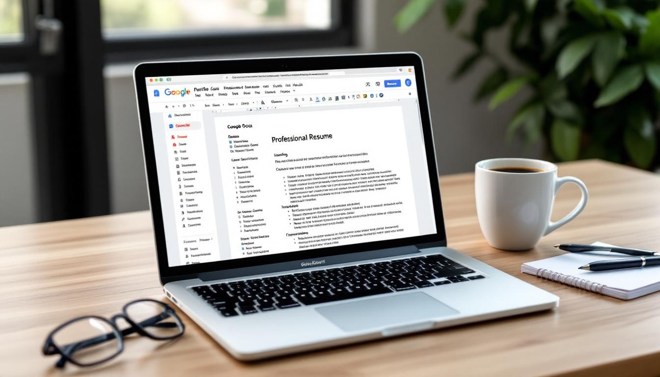
Enter Google Docs — your new best friend for knocking out a resume that grabs eyeballs. Yes, it’s free. Yes, it’s easy. And boy, does it let you shine.
This guide? Think of it as your treasure map to crafting that killer CV using Google Docs’ Resume format. We’re talking everything from picking the right template (because first impressions matter) to ace formatting tips that will make your application pop. Let’s do this.
Setting Up Your Google Docs Resume format
Choose a Professional Template
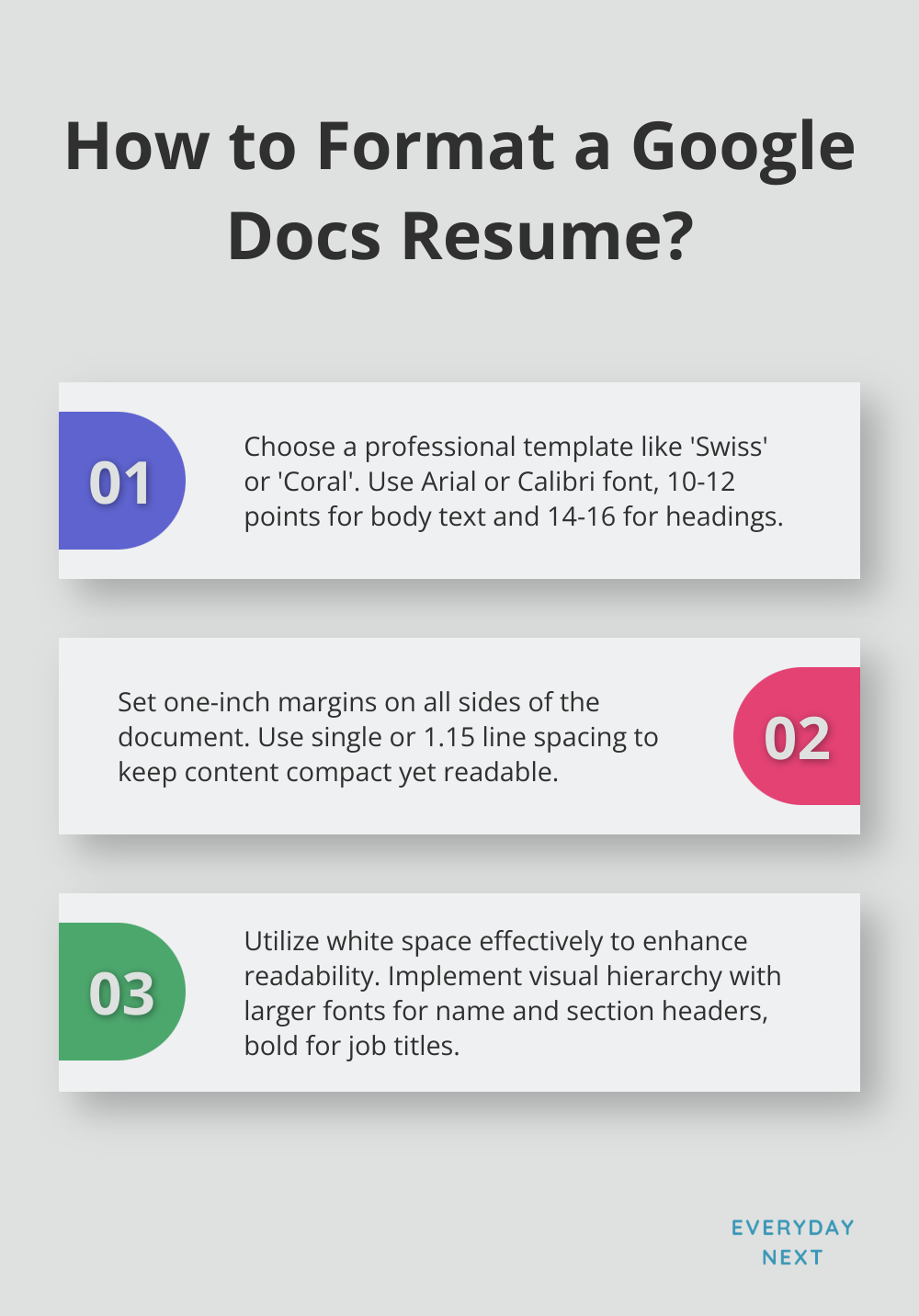
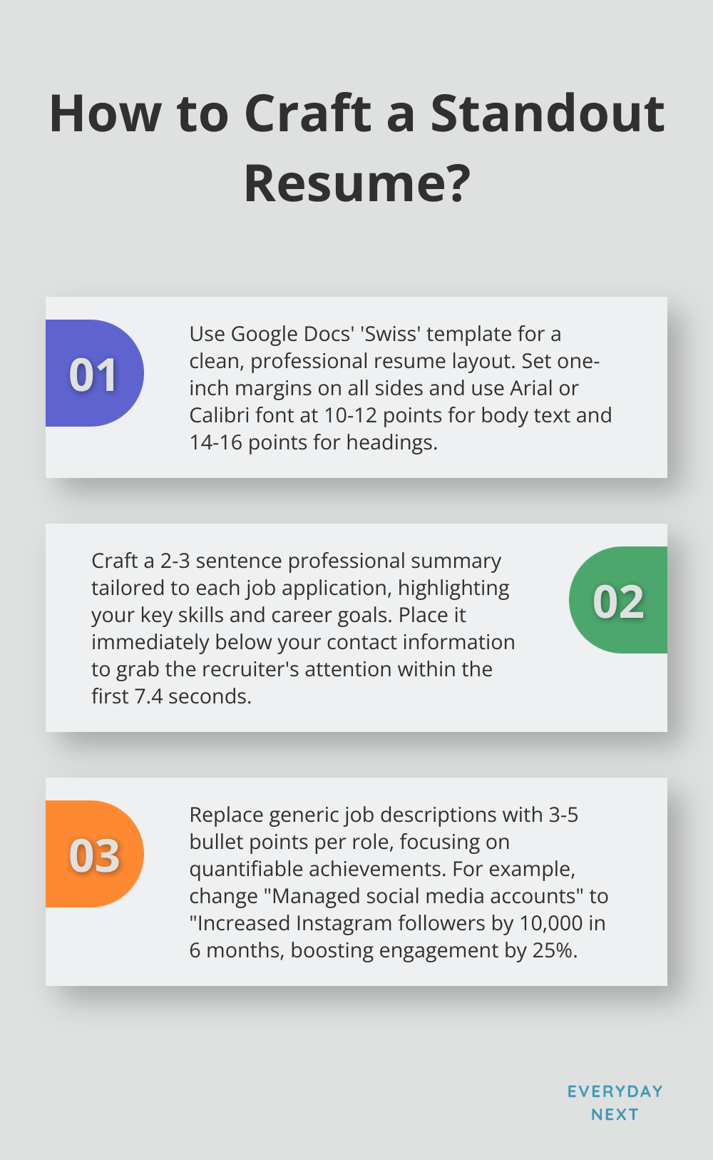
First stop on this resume train… head over to docs.google.com. Sign in, see that colorful ‘plus’ icon? Click it, you’re creating something new and shiny. Google Docs-yep, even they have a stash of professional templates to spiff up your resume. Hit ‘Template Gallery’ at the top, cruise down to the ‘CV’ section. Here’s the deal-‘Swiss’ is your go-to for clean lines and a layout that’s as easy on the eyes as a lazy Sunday. Feeling a bit more artsy? Check out ‘Coral’ – a splash of color without turning your resume into a rainbow explosion.
Customize Your Layout
Picked a template? Good. Now, swap out that placeholder text with your info. Font consistency-it’s a thing, trust me on this. Stick to the classics: Arial or Calibri (10-12 points for body, 14-16 for headings). Why? Simple, they’re easy to read and ATS-friendly too (shoutout to Applicant Tracking System)-robots love ’em.
Set Proper Margins and Spacing
Margins and spacing-these are the unsung heroes of resume readability. Here’s the rule: one inch on all sides. Enough space to fit your wisdom without squandering an inch of precious page. Line spacing, keep it tight but not suffocating-single or 1.15 will do-so your resume doesn’t resemble a novella.
Utilize White Space Effectively
Let’s chat white space. It’s not just for graphic designers-it’s your new best friend. Keeps things clean, tidy, and lets key info pop. Resist the urge to fill every square inch with text. Give standout sections like your name and headers some breathing room. This strategy? It’s a scout for the eyes, leading recruiters to the gold nuggets of info they crave.
Implement Visual Hierarchy
Visual hierarchy-fancy term, simple concept. Here’s the scoop: larger font for your name, section headers steal the show. Bold those job titles, let italics do their thing for company names. This structure? It’s like GPS for recruiters-fast tracks them to the info they want, upping your resume’s shot at leaving a mark.
You’ve laid the groundwork. Now, time to fill those sections with content that screams “hire me”-showcase those skills and experiences like a pro.
What Goes in Your Resume
Contact Information and Professional Summary
Alright, folks, let’s kick things off with gusto. Slap your name in a supersized font at the very top-scream your existence! Then, follow it up with your phone number, email, and your secret hideout (okay, just your city and state). Oh, and if your LinkedIn page isn’t just a graveyard of old jobs, throw in that URL too.
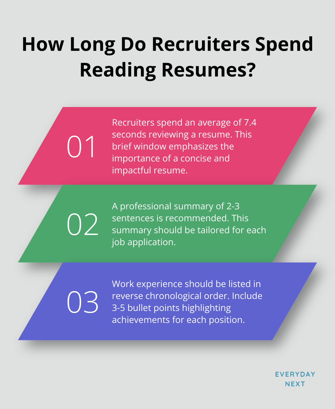
Now, on to the pièce de résistance-your professional summary. Picture it as a 2-3 sentence elevator pitch packed with your essence, your badass skills, and where you’re aiming to go. And here’s the kicker-tailor this for every single job pitch you throw out there. FYI, folks at Ladders found out recruiters give your resume a swift 7.4-second glance-so make every nanosecond tick!
Work Experience and Achievements
Here’s your spotlight-shine, baby, shine. List your gigs in reverse order because nobody cares what you did back in high school. Include:
- Company name and location
- Your job title-because you’re more than a ‘worker bee’
- Dates of employment
- 3-5 bullet points that scream “hire me!”
The magic sauce? It’s all results, folks, forget the mundane tasks. Swap “Managed social media accounts” for something with teeth: “Skyrocketed Instagram by 10,000 followers in half a year, boosting engagement by 25%.” Numbers are your new best friends.
Education and Relevant Skills
Keep the education thing brief-degree, institution, graduation date, boom, done. Fresh grads can drop in some juicy coursework or impressive academic feats.
Now, when it comes to skills-be precise. Forget “Microsoft Office”-get specific like “Master of Advanced Excel wizardry” or “Crafted killer PowerPoint presentations.” Mirror these skills to what the job ad is screaming for. They want “data analysis,” and you’ve got it? Shout it from the rooftops.
Optional Sections for Added Impact
Think certifications, volunteering, and languages-potential game-changers if they hit the mark. CPR certified for a healthcare gig? Gold. Fluent in Spanish for a company eyeing Latin America? Jackpot.
Remember, your resume is your billboard, not a memoir. Every pixel of ink should earn its spot. A laser-focused, achievement-laden resume levels up your shot at those elusive interviews.
Next up, we’ll delve into the art of resume styling. Keep an eye out for a rundown on turning your resume into a slick, professional portfolio that demands attention from the gatekeepers-recruiters and hiring brass.
Make Your Resume Stand Out
Choose Fonts Wisely
Think of your resume as your personal billboard. Fonts? They set the tone. Go with Arial or Calibri – solid choices across most fields. Stick to 10-12 point size for the main show, and 14-16 for the headlines. Keeps it neat… professional… easy on the eyes.
Use Bullet Points Effectively
Dense blocks of text? Ugh, no one wants that. Bullet points to the rescue! They’re like espresso shots of info. Aim for 3-5 per gig, each leading with a punchy action verb. Swap out “Was responsible for social media” for something like “Boosted social media engagement with targeted strategies.” Now you’re talking.
Apply Strategic Formatting
Bold, italics, underline – they’re like seasoning. A little goes a long way. Bold your job titles to get noticed. Italicize company names or dates for flair. But don’t go wild, otherwise, it ends up looking like a Pinterest board gone wrong.
Add a Subtle Color Accent
Let’s talk color – just a hint. A muted blue or green for headers or your name can do wonders. But remember, it has to be printer-friendly (no neon throwbacks to the ’80s, please!).
Create Visual Hierarchy
Guide the reader, like breadcrumbs in a forest. Larger fonts for your name and section headers because, you know, importance. Bold those job titles, italicize company details. This hierarchy makes it a breeze for recruiters to get to the goods fast.
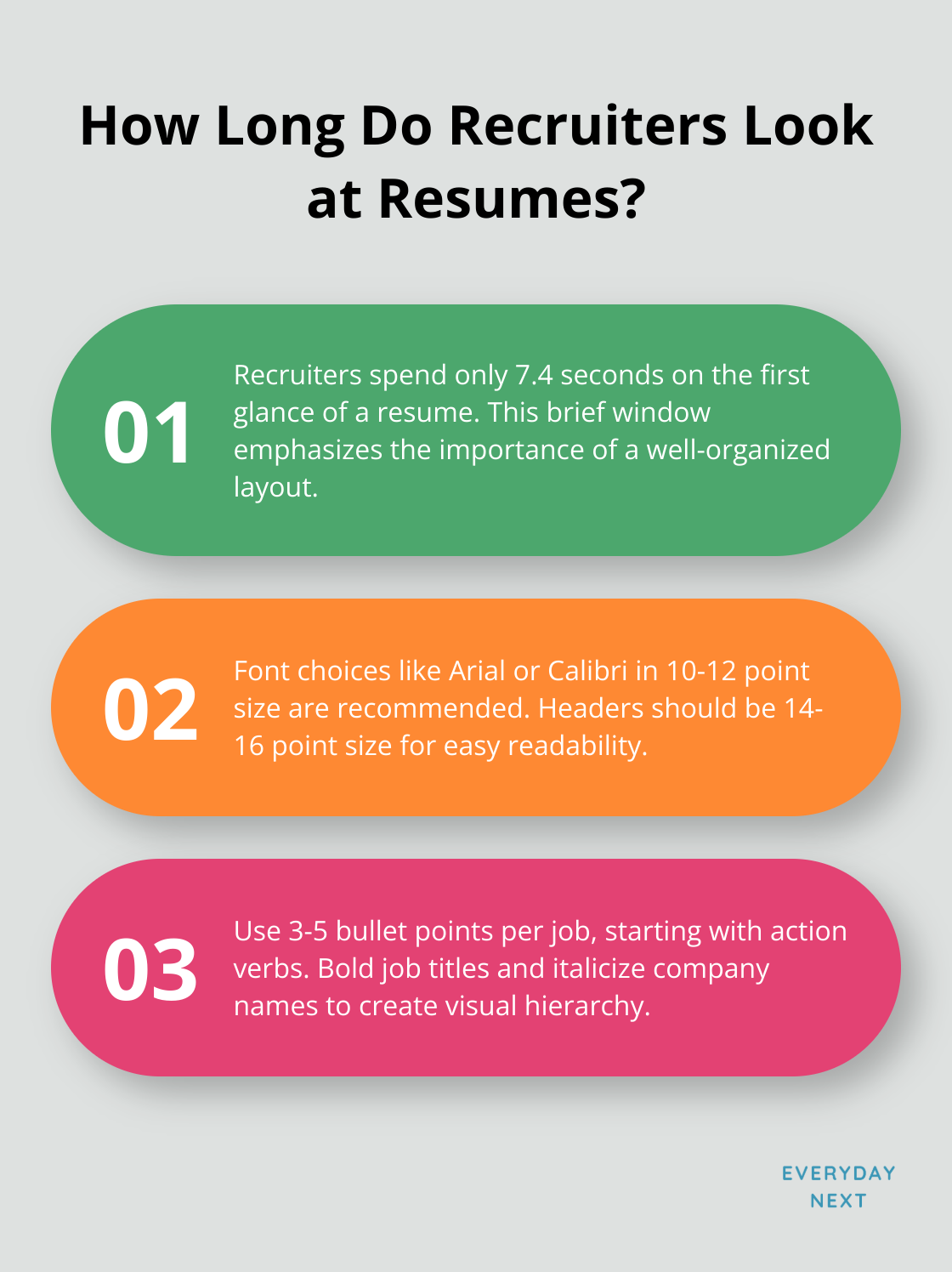
It’s all about creating a resume that’s a breeze to scan and packs a punch. A study by TheLadders discovered that recruiters spend a mere 7.4 seconds on the first glance. So, you’ve got seconds to make a splash. Clean, organized, and showcasing your awesomeness – that’s the game plan.
Give these tips a whirl and see how they elevate your resume. The future boss will thank you for making their life a tad easier!
Final Thoughts
So, you’re diving into the job hunt with Google Docs in hand? Smart move. Here’s the deal-Google Docs gives you a leg up with resumes, providing a rock-solid starting point for a killer application. Take their templates, tweak ’em, polish those layouts, and toss in the must-have sections to spotlight your skills. And hey, triple-check that thing-run it past a friend too-so it’s as tight and slam-dunk as a Steph Curry three-pointer.
Every job’s different, so adapt that resume like you’re choosing the right outfit for a first date. It says you’re serious about the gig and you’ve done your homework. This laser-focused approach (mix it up with some snazzy formatting) can seriously up your interview odds. Keep it polished with uniform fonts, sharp bullet points, and a splash of color-make it pop and easy on the eyes.
At Everyday Next, we’ve got your back on the career journey. For more on leveling up and smashing those career goals, check out our stuff at Everyday Next. With an ace resume in your corner, your next big break is just on the horizon.
Related Posts


Previous Post
Next Post