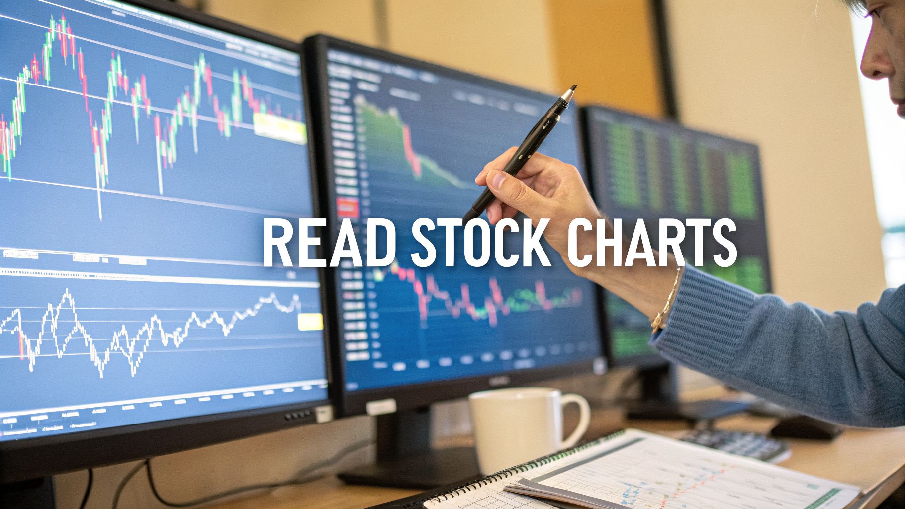
A Beginner’s Guide on How to Read Stock Charts
If you want to read a stock chart, you need to understand three things first: price action (candlesticks), timeframes, and volume. Think of these as the basic vocabulary of the market. Together, they paint a picture of the constant tug-of-war between buyers and sellers, showing you who’s in control and how committed they are. Getting these fundamentals down is your first real step toward trading with a plan instead of just guessing.
Why Reading Stock Charts Is an Essential Skill
Before you put another dollar into the market, you have to get a handle on what stock charts are actually showing you. They’re more than just a bunch of squiggly lines; they’re a visual record of market psychology in action. Every single tick up or down is the result of millions of people making decisions based on news, earnings reports, and their own gut feelings.
This guide is designed to teach you how to read that story. We’re going to look past the headlines and get into the real language of the market—the candlesticks, trends, and indicators that tell you what’s really happening.
Learning this skill gives you a massive edge. It allows you to:
- Spot Opportunities: Find better entry and exit points with more confidence.
- Control Your Risk: See when the market sentiment is turning against you so you can protect your money.
- Trade with a Plan: Swap emotional, knee-jerk reactions for a repeatable, analytical process.
From Guesswork to Strategy
Imagine a pilot learning to read a weather map. To you or me, it’s just a bunch of lines and symbols. But to the pilot, it’s a clear picture of what’s ahead—turbulence, calm skies, or a coming storm. Learning to read charts is the same. Instead of getting caught off guard by a market shift, you start seeing the patterns that signal what’s likely on the horizon.
A stock chart is a powerful tool because it turns abstract financial data into a concrete visual narrative. It filters out the noise and focuses on the two things that ultimately matter: price and volume.
This skill is absolutely foundational. It’s the bridge between knowing what company to buy and knowing when to pull the trigger. If you're still building that foundation, our guide on how to invest money for beginners is a great place to start. In the end, reading charts gives you the confidence to trust your own analysis and stick to your strategy.
The Building Blocks of a Stock Chart
Every stock chart tells a story—a constant tug-of-war between buyers and sellers. To understand that story, you first need to learn its language. This language is built on three core elements: candlesticks, timeframes, and volume. Getting a solid grip on these will transform what looks like a random series of lines into a clear narrative of market sentiment.

Decoding Candlesticks: The Heartbeat of the Market
Let's zoom in on a single candlestick. Think of it as the most basic but powerful component on your chart. In one quick glance, each candle gives you four vital pieces of data for a specific period: the open, the close, the high, and the low.
The thick, rectangular part is called the body. This shows you the price range between where the stock opened and where it closed. Sticking out from the top and bottom are thin lines called wicks (or shadows), which pinpoint the absolute highest and lowest prices reached during that same period.
- A green (or white) candle means buyers were in control. The price closed higher than it opened. Simple as that.
- A red (or black) candle tells you sellers won the round. The price closed lower than where it started.
The shape of the candle is just as important. A long, solid body signals strong conviction. On the other hand, a tiny body with long wicks is a clear sign of indecision—a real battle was fought, but neither side landed a knockout blow.
Understanding Candlestick Components
To break it down even further, here's a quick reference table I put together. It helps to have this handy when you're just starting out.
| Component | What It Represents | Bullish (Green/White) Signal | Bearish (Red/Black) Signal |
|---|---|---|---|
| Body | The range between the open and close price | The close is higher than the open (buying pressure) | The open is higher than the close (selling pressure) |
| Upper Wick | The highest price reached during the period | Shows how high buyers pushed the price | Shows an attempt to rally that was rejected by sellers |
| Lower Wick | The lowest price reached during the period | Shows an attempt to sell that was rejected by buyers | Shows how low sellers pushed the price |
| Color | The net direction of price movement | Buyers won the session | Sellers won the session |
This table neatly summarizes the story each part of the candle tells, making it easier to read the market's mood at a glance.
Choosing Your Timeframe
The story a chart tells can change completely based on the timeframe you select. Each candle represents a fixed period, so your choice here really needs to match your trading style.
If you’re a swing trader or a long-term investor, a daily chart (where one candle equals one day) is your go-to for seeing the bigger picture. But if you’re a day trader, you’ll be living on something like a five-minute chart, where the action is fast and furious. Timeframes can be as short as one minute or as long as a month. For a deeper dive into market hours, check out our guide on the hours for the world's major stock markets.
Your chosen timeframe is your lens for viewing the market. A weekly chart filters out the daily noise to show you the long-term journey, while an intraday chart magnifies every small skirmish.
When you look at a long-term chart of the S&P 500, you're seeing decades of history. Over the 150 years ending in December 2025, the index returned an annualized 9.463% with dividends reinvested. But zoom into the candlesticks on that same chart, and you'll see the brutal volatility traders faced day-to-day. A classic "head and shoulders" pattern, for example, helped sharp-eyed chartists predict the 2000 dot-com crash after the NASDAQ peaked at 5,048, just before it cratered by 78%.
The Importance of Volume
Last but certainly not least is volume. You’ll see it as a set of vertical bars at the bottom of your chart. Volume is simply the total number of shares that were traded during a given period. It's an absolutely critical piece of the puzzle because it measures the conviction behind a price move.
Here's how I think about it: if a stock price makes a big move, volume tells you how many people showed up to the party.
- High volume during a price jump is like a roaring crowd. It confirms the move is genuine and has widespread support.
- Low volume is like a whisper. It suggests a lack of real interest, making the price move feel a lot less reliable.
Always glance at the volume to confirm what you're seeing in the price. A breakout above a key resistance level on massive volume is a powerful signal. The same breakout on weak volume? I’d be skeptical. Together, candlesticks, timeframes, and volume give you the solid foundation you need to start reading any chart with confidence.
Mapping the Market's Direction
Okay, so you’ve got a handle on what individual candlesticks are telling you. Now, it's time to zoom out and see the bigger picture. This is where we figure out the market's overall story—the trend. Is it climbing a mountain, sliding down a hill, or just wandering around in a flat field?
Honestly, identifying the trend is the single most important bit of context you can have. It’s like knowing which way the river is flowing before you put your boat in the water.
The market is really only ever doing one of three things.

Uptrends, Downtrends, and Everything in Between
The easiest way to see the trend is to look at the rhythm of the peaks (highs) and valleys (lows) on the chart.
- Uptrend (Bullish): This one's easy to spot. You'll see a series of higher highs and higher lows. It's a clear signal that buyers are in charge, consistently pushing the price up. Every time the price dips, buyers jump in at a higher level than before, showing real confidence.
- Downtrend (Bearish): Just flip that idea on its head. A downtrend is a sequence of lower highs and lower lows. This tells you sellers have the upper hand. Each attempt to rally gets shot down at a lower price than the last.
- Sideways or Ranging Market: Here, the price is just bouncing between two levels, not really going anywhere. It’s like a tug-of-war where neither the buyers nor sellers can win. The market is basically undecided.
Remember the incredible run Tesla (TSLA) had? That was a classic, powerful uptrend. If you pull up that chart and draw a line connecting the bottom of each dip, you get a clear upward-sloping line. We call that a trendline, and it’s a super simple tool for visualizing the "floor" that was holding the price up.
The Battlegrounds: Support and Resistance
Once you can see the trend, you’ll start to notice specific price levels where the action really heats up. These are support and resistance levels, and they’re not just lines on a chart—they are psychological battlegrounds where buyers and sellers clash.
Support is the floor. It’s a price level where buyers have historically stepped in with enough force to stop a price drop and turn it around. When the price gets near a support level, a lot of traders see it as a bargain-hunting opportunity.
Resistance is the ceiling. It’s a level where sellers have typically taken control, stopping a rally in its tracks. As the price approaches resistance, traders who bought lower might start cashing out, and new sellers will often jump in.
Pro Tip: Think of support and resistance as zones, not laser-thin lines. The price will often poke through them a bit before reversing. Always give these levels a little breathing room.
How to Actually Use These Levels
Finding support and resistance is more of an art than a science. Scan the chart for places where the price has stalled or reversed multiple times. The more times a level is tested and holds, the stronger and more significant it becomes.
Here’s how this plays out in real trading decisions:
- Finding Entry Points: A classic strategy is to wait for the price to pull back to a key support level in an uptrend and then buy when it bounces.
- Placing Your Stop-Loss: These levels give you a logical place to put your safety net. If you buy at support, you could set your stop-loss just below that zone. If the price breaks through, it's a clear sign your trade idea was wrong.
- Setting Profit Targets: Resistance levels are natural places to think about taking profits. If you’re in a winning trade, you might plan to sell just before the price hits a known resistance area where sellers are likely to show up.
Getting a feel for these key levels is a huge step forward in your analysis. It's a fundamental concept that pros rely on every day. In fact, it’s interesting to see how market experts apply these ideas in their own forecasts; you can learn more about Tom Lee's latest market predictions in our related article.
Adding Technical Indicators to Your Toolkit
Think of trendlines and support/resistance zones as the map of a stock chart. If that’s the case, then technical indicators are your specialized gear—your compass, altimeter, and weather vane. These are essentially calculations based on a stock's price, volume, or both, designed to give you an extra layer of insight into market psychology.
Let's be clear: indicators don't have a crystal ball. They can't predict the future. What they can do is help you confirm what you’re already seeing on the chart and give you a heads-up about potential shifts in momentum. The secret isn't to plaster your chart with dozens of blinking lines. It's to master a few of the most reliable tools and learn how they work together.
Using Moving Averages to Smooth Out the Noise
One of the first indicators most traders learn is the Moving Average (MA), and for good reason. It’s simple and incredibly effective. It just takes the average closing price of a stock over a specific period and plots it as a single, flowing line right on your chart. Its main job is to cut through the day-to-day "noise" of price swings and show you the real, underlying trend.
You’ll run into two main flavors of moving averages:
- Simple Moving Average (SMA): This is the straightforward average of prices over your chosen timeframe. No frills, just the raw average.
- Exponential Moving Average (EMA): This one is a bit quicker on its feet. It gives more weight to the most recent prices, so it reacts faster to new market information.
For anyone starting out, the 50-day and 200-day SMAs are legendary. The 50-day gives you a good look at the medium-term trend, while the 200-day is the benchmark for the long-term trend. The rule of thumb is simple: when the price is trading above these lines, the mood is generally bullish. When it drops below, things are looking bearish.
Diving into stock charts feels like decoding a treasure map, especially when real stats from major markets light the way—consider how moving averages have steered investors through turmoil. The 200-day simple moving average (SMA) is gold: historically, S&P 500 closes above it 70% of the time in bull markets, but drops below signal bears, like in 2008 when it crossed under in September, preceding a 57% crash. Over 100 years to 2025, the S&P averaged 10.463% yearly returns, but chart readers using the "golden cross"—when the 50-day SMA crosses above the 200-day—caught 80% of major uptrends. You can discover more insights about market trends on TradingEconomics.com.
Gauging Momentum with the RSI
Next up is the Relative Strength Index (RSI), a classic momentum oscillator. In plain English, it measures how fast and how far prices are moving. The RSI bounces between 0 and 100 and usually appears in its own little window below your main price chart.
Its main purpose is to help you spot potentially overbought or oversold conditions.
- Overbought: A reading above 70 is a red flag. It suggests the stock has climbed too high, too fast, and might be running out of steam. A pullback or a period of sideways trading could be next.
- Oversold: A reading below 30 is a green flag. It suggests the stock has been beaten down too much and could be due for a bounce.
Crucial Tip: Never sell just because the RSI hits 70 or buy just because it dips below 30. In a powerful uptrend, a stock can stay "overbought" for weeks. Think of these levels as warnings to pay closer attention, not as automatic buy or sell triggers.
Spotting Trend Changes with MACD
The Moving Average Convergence Divergence (MACD) indicator sounds complicated, but it's another powerhouse for tracking a trend's strength, direction, and momentum. It’s made up of two lines (the MACD line and the signal line) and a histogram that shows the distance between them.
The most common signal traders watch for is the crossover. When the MACD line crosses above the signal line, it’s a bullish signal. It tells you that upward momentum is picking up. Conversely, when it crosses below the signal line, that's a bearish signal, hinting that the sellers are gaining control.
For those looking to expand beyond basic indicators, understanding advanced metrics like the Greeks can provide deeper insights into market dynamics.
Comparing Popular Technical Indicators
Each indicator tells a different part of the story, and using them together helps you build a much clearer picture. The table below is a quick cheat sheet comparing the three tools we just covered, so you know which one to reach for and when.
| Indicator | What It Measures | Key Signal for Buy | Key Signal for Sell |
|---|---|---|---|
| Moving Averages | The underlying trend direction by smoothing price data. | Price crosses above a key MA; a faster MA crosses above a slower one (e.g., Golden Cross). | Price crosses below a key MA; a faster MA crosses below a slower one (e.g., Death Cross). |
| RSI | The speed and magnitude of recent price changes (momentum). | Moves up from oversold territory (below 30), indicating potential for a bounce. | Moves down from overbought territory (above 70), indicating a possible pullback. |
| MACD | The relationship between two moving averages (trend momentum). | The MACD line crosses above the signal line, suggesting building upward momentum. | The MACD line crosses below the signal line, suggesting building downward momentum. |
Ultimately, these indicators are strongest when they confirm each other. A signal from one is interesting; a signal from two or three is a setup you should pay attention to. For instance, an investor might feel much more confident buying a stock like QQQ when its price is safely above the 200-day SMA and the RSI is just starting to climb out of oversold territory. To get more familiar with specific market products, you can check out our guide on what is QQQ.
How to Analyze a Stock Chart from Scratch
Alright, let's pull all these concepts together and walk through how to approach a brand-new chart. Think of this as the practical, repeatable process you can use every single time to cut through the noise and build a clear picture before you even think about placing a trade.
We’re going to build our analysis layer by layer. We’ll start with the big, overarching story the chart is telling us and then gradually zoom in to the finer details. It’s a framework that helps keep emotions out of the driver's seat.
This flowchart gives you a great visual of the workflow: first, you figure out the main trend, then you gauge the current momentum, and finally, you watch for signs of a potential change.

Starting with the big picture—the market's general direction—is non-negotiable. It provides the essential context for everything else you see.
Start With The Long-Term Trend
First thing's first: zoom out. Before you get lost in the day-to-day wiggles, pull up a weekly chart. On this timeframe, each candle represents an entire week of trading, and your only job is to answer one simple question: What's the primary, long-term trend here?
- Is the stock consistently making higher highs and higher lows over the past year or more? That's a clear uptrend.
- Is it carving out a series of lower lows and lower highs? That's a downtrend.
- Or is it just bouncing around in a big, messy box? We call that consolidation.
This step is your foundation. Fighting the primary trend is like trying to swim upstream in a powerful river. It's not impossible, but you're making your life much, much harder.
Identify Key Support and Resistance Zones
Okay, now that you have the long-term context, switch over to the daily chart. Let your eyes scan across the chart horizontally and start marking the most obvious support and resistance zones. You're looking for price levels where the stock has repeatedly stopped, reversed, or just churned for a while.
These aren't perfect, laser-precise lines; think of them as broad "zones" of interest. These are the historical battlegrounds between buyers and sellers, and chances are, they'll be important again. Get them marked up on your chart.
Add Moving Averages for Confirmation
Next, let's add a couple of key moving averages to that daily chart, like the 50-day and 200-day SMAs. These are fantastic for confirming the trend you already spotted and showing you how the price is behaving around these important dynamic levels.
Is the price holding strong above both the 50-day and 200-day SMAs? That's a very healthy, bullish sign. Is it trapped underneath both? That's a big red flag for the bears. Watch closely what happens when the price pulls back to one of these moving averages—does it bounce off it like a trampoline (support) or get rejected like a brick wall (resistance)?
Check Momentum Indicators
Now it's time to look under the hood and check the engine's power. Go ahead and add your favorite momentum indicators, like the RSI and MACD, to a separate window below your price chart.
- Glance at the RSI: Is it overbought (above 70), oversold (below 30), or somewhere in between? Generally, a reading above 50 suggests the bulls have the momentum.
- Look at the MACD: Have the lines recently crossed over? Is the histogram getting bigger, suggesting that momentum is accelerating?
These tools give you a feel for the strength behind a move. For example, a stock pushing up against a major resistance zone while the RSI is falling is a classic warning sign that the rally might be running out of gas. If you're looking for a deep dive into deciphering these kinds of market movements, this guide on how to read crypto charts is a fantastic resource.
Hunt for an Entry Trigger
Finally, with all that homework done, you can zoom in on the price action right at your key levels. This is where you start looking for specific candlestick patterns that could act as your trigger to get into a trade.
Let's say a stock has pulled back perfectly to a support zone that also lines up with the 50-day moving average. If you suddenly see a big, powerful bullish engulfing candle form right there, that could be the "go" signal you were waiting for.
A+ trade setups happen when multiple pieces of evidence line up. A key support level, a rising moving average, a bullish candlestick pattern, and confirmation from an indicator all pointing in the same direction? That's a high-probability opportunity.
This last part is all about timing. Your big-picture analysis tells you where to look for a trade, and the candlestick patterns tell you when the time might be right to act. Just never forget to pair any entry with a clearly defined stop-loss to protect your capital.
Common Questions About Reading Stock Charts
Jumping into stock charts can feel like you're trying to learn a whole new language. It's totally normal for questions to pop up as you start putting these ideas into practice. Let's tackle ten of the most common ones I hear from people just starting out. My goal here is to clear things up, boost your confidence, and help you dodge some of those early-stage mistakes.
1. How Long Does It Take to Get Good at Reading Stock Charts?
Honestly, there's no magic number. Most people I've worked with start feeling comfortable with the basics after a few weeks of looking at charts every day. But mastery? That’s a lifelong pursuit because the markets are always changing.
The real key is to start small. Pick one or two strategies and really stick with them. And be diligent about reviewing your trades—the wins and the losses—because that’s where the real learning happens.
2. Can I Rely on Technical Analysis Alone?
While some hardcore traders swear by it, I’ve found that the most consistently successful investors blend two approaches. They use fundamental analysis (digging into a company's financial health) to find solid companies, and then they use technical analysis to pinpoint the best time to actually buy or sell. Using both just gives you a much richer, more complete picture.
3. What Is the Best Timeframe to Use on a Chart?
This one comes down to your personal style and how long you plan to hold a position.
- Long-term investors are usually camped out on the weekly and daily charts, looking at the big picture.
- Swing traders tend to live on the daily and 4-hour charts, trying to catch moves that last a few days or weeks.
- Day traders need speed, so they're glued to the 1-minute, 5-minute, and 15-minute charts.
My personal tip: Always start your analysis on a higher timeframe, like the daily chart. Get a feel for the main trend first before you zoom in to find an entry point. It provides crucial context.
4. Are Chart Patterns Like the 'Head and Shoulders' Reliable?
Think of chart patterns in terms of probability, not certainty. Nothing in the market works 100% of the time. These patterns are useful because they reflect recurring human psychology—fear and greed playing out visually. But you should always look for other confirmations, like a spike in volume, and never, ever go all-in on a single pattern without solid risk management.
5. Do I Need Expensive Software to Read Charts?
Absolutely not. In fact, most online brokerages today offer fantastic, free charting tools that have all the standard indicators you'll need. There are also incredible free web platforms like TradingView and Finviz that are used by beginners and pros alike. Don't feel pressured to pay for fancy software when you're starting out.
6. What's the Most Common Mistake Beginners Make?
Without a doubt, it's "analysis paralysis." This happens when you clutter your chart with so many indicators that you just get a mess of conflicting signals. You're better off mastering 2-3 indicators that you understand inside and out.
Another huge one is ignoring volume. Volume is your confirmation tool—it tells you how much conviction is behind a price move.
7. How Important Is Volume in Chart Analysis?
It's everything. I like to call volume the "conviction meter." A stock breaking out above a key resistance level on high volume is a powerful, validated move. But if you see that same breakout on weak, barely-there volume? Be suspicious. That move has a much higher chance of failing and turning into a trap.
8. What Is a 'Fakeout' and How Do I Avoid It?
A "fakeout" is one of the most frustrating things in trading. It’s when the price pokes just above a resistance level (or below a support level), luring you into a trade, only to slam back in the other direction.
The best way to sidestep these is to wait for confirmation. Don't just jump in the second a level is breached. Wait for the candlestick to close decisively above that level, and ideally, you want to see it happen with strong volume. Patience pays off.
9. Is It Better to Use a Logarithmic or Linear Scale?
It depends on your perspective. If you're looking at a chart that spans many years and has seen massive price growth (like Amazon or Apple), a logarithmic (log) scale is way better. It shows percentage moves, so it puts a $10 move on a $20 stock in the same perspective as a $100 move on a $200 stock.
For shorter-term charts—anything from intraday to a few months—a standard linear scale works just fine.
10. Can I Use Chart Reading for Cryptocurrency or Forex?
You bet. The core principles of technical analysis—trends, support and resistance, patterns, and indicators—are pretty universal. They apply to any market that's driven by human supply and demand, whether it's stocks, forex, commodities, or crypto.
Of course, every market has its own quirks and personality, but learning to read a stock chart gives you a rock-solid foundation for analyzing anything. Thinking about the nature of investment risk will also help you apply these skills with a much more balanced perspective.
At Everyday Next, we're dedicated to providing clear, actionable insights to help you navigate your financial journey. To continue learning and stay ahead of the curve, explore more of our guides and analysis at https://everydaynext.com.
Related Posts


Previous Post
Next Post